The text below is copied from wtsduplication.com. The original online article can be found by clicking here.AT1 Research : Album Cover Design
The first disc records, ones that we would recognize as such, appeared around 1910. Most often these were packaged in plain brown Paper or cardboard sleeves. Occasionally and enterprising retailer would print his store name on the sleeve but generally they were unadorned.

In the early 1920's retailers started gathering many of these cardboard sleeves and binding them together with heavy paperboard or leather covers. These looked similar to large photo albums and, borrowing the name, were sold as record albums. These albums offered much greater protection for the discs than the original packaging and were seen as indispensible to disc owners that had seen too many of their fragile records broken.

Beginning in the 1930s the record companies started using these record albums to distribute bundles of records from one performer or a collection of performers with similar musical styles. Some of the first cover designs can be traced to these albums and the record company’s desire to graphically communicate the music each album held.

Alex Steinweiss the art director for Columbia Records is given credit for the concept of modern cover art. He experimented with different concepts and images through the late 1930s and into the early 1940s. During this time Columbia Records rebounded from the terrible years they had suffered during the depression to become one of the most prominent record companies in the United States. Much of this was due to their ground breaking use of graphical design. (Of course signing Frank Sinatra may have helped a little too).By the close of the decade all major recording companies had graphic design professionals on staff.

The golden era of cover art design began in the early to mid 1960s and lasted into the early 1980s. During this time the major format for music was the 12 inch, long play disc or LP. Cover art became a part of the musical culture of the time. Often used to express graphically the musician’s artistic intent, it helped connect and communicate to listeners the message or underlying theme of the album.

Designers, photographers, and illustrators sometimes became famous for their cover art creations. Such notables as Andy Warhol and Frank Frazetta were taken from being known in their industry to becoming household names due to their cover art graphic design work. So respected and desired are the designs and illustrations found in cover art that there are numerous art galleries that specialize in helping collectors find rare album covers.

As the medium for recording transitioned from the LP to the compact disc many graphic designers failed to transition with it. Having worked for so long with the much larger canvas of the LP cover, switching to the smaller CD case left most designers dissatisfied with their results. Often artist and record companies simply tried to shrink the LP size art to fit the CD.

Album cover art, now almost exclusively CD and CD packaging artwork, went through a period of change and rebirth in the 1990s. Designers learned to capture snapshots and portions of the artist’s musical intent rather than trying to convey the entire message. Also designers started conveying the emotion of the music rather than the musical intent.

In the late 90s computer design programs started to overcome the physical limitations of the smaller CD packaging. With the ability to draw much tighter, finer lines and have even small details look crisp and sharp, once again designers were free to explore a larger variety of design options. As the technology continued to improve graphic designers adapted and were once again producing world class artwork.

In the present, CD design is undergoing a true renaissance. Rather than becoming obsolete in the digital age as many thought it would, graphic design is once again proving itself as the difference maker. The internet is now the largest record store imaginable. Now rather than browsing a few hundred albums or songs at a time you may be exposed to thousands and thousands. Since it would be impossible to listen to portions of all those thousands of songs the design of the accompanying artwork must cause potential listeners to stop and take notice and give this album a try.

Album Covers: Research Into Existing Products

This was a task that we had to do in class which was simply trying to see what were the most common conventions that appear in a CD pack. We had a look at the back cover the front cover the inside back, inside front and the spine. This task was just to give us an idea of the sort of things we could possibly include in the our digipack. The main things that came up for the front cove where the artist name, album title and also an image. For the back cover the main things were the track listing, year it was made and also the record label.
What i feel i have learned from this task is that having conventions plays a major part when creating an album cover. This helps with artist recognition, when a customers buys an album they will have a look at the artist name of the album to judge whether they know them or not. Its not just the artist name that is need in some cases you don't need to have the artist name you can just have an image of them which will automatically let the customer know who has sang in the album.
Also i have learned that including the track listing is one of the major part of the album because it leafs the customer know what songs they can expect to hear on the album and they can see whether their favourite songs from that artist are going to be including into the album as well. I have also learned that the font used for the album tends to be the same font used for the track listing as well.
The main thing i have learn about album covers are that majority are all the same, all including an image, album title and the artists name.
For this task i worked with two of my fellow classmates.

3 Album analysis
Without Steinweiss invention of having artful albums covers, artist wouldn't be able to engage with their listeners on a more visual and artistic level. I have chosen to have a look at a few artists innovative ideas on what they thought would most appeal to their listeners.
Looking at the cast majority of albums and I gather that they mainly consist of three key factors; Artists name, album title and an image. However the media and peoples preferences have changed through time causing some of these codes and convention to be broken.

Abby Road (1969)-The Beatles
This album cover is one of the most iconic albums out there to this date. It have the four band members of The Beatles walking across a zebra crossing in a perfect mirror image and perfectly aligned line.
This album cover is very different to the ACDC album cover in that it they are no tight positions all the band members are spread out in a row following each other. However there is a big question is this cover, which is why is Paul McCartney not wearing any shoes and smoking also walking out of tune with the rest of the and members.
There's a sense of irony in this image in that the band is called The Beatles and in the background there is a picture of a Beatle motor vehicle.
There is now a webcam on Abby Road where everyone can re-live the moment captured in the image.

Highway To Hell (1979)- ACDC
Highway To Hell was an ACDC album and one of the iconic and best album covers they ever created. Looking at the cover we can notice that the bands name is located at the top above the band and with the album title at the bottom of the cover. Analysing the cover in more depth we can work out that instantly that this is a rock bands cover because of how font of the band name is sharp and edgy it looks very aggressive in the colour and also the lighting bold in the middle. The red could connate that their is danger within in the band.The album title gives a different feel to the band name because its in yellow however was is being said is very dark. Its placed in the middle near enough the same width as the band name. Also the title is placed as the bottom which putting to and two together is very smart because hell is below and I feel there's a link there to why they put it there.
Looking at the image now, the band appears all together in the cover however the order in which they are being shown shows the importance order in the group. The main singer has been made to appear as the devil this could mean that he controls the group, we don't know, but what we know is that they feel that their is a link with rock music and how it can be associated with hell. they are a lot of emotions being portrayed in this cover. The main vocalist appears to show an express of " I don't care, I do what I want!". Whereas the band member on the right appears to be smiling and appears friend. With the others in the back ground have expressionless faces as if they had demons in them and were truly in hell. Also looking at the cover I noticed and worked out that the font was small in order for the image to dominate the cover.
Decoding a CD Digipack


Decoding an artist similar to my artist
I explored other alum's which i could decode. This time i went for an artist in a similar genre to my artist

This is one of Drakes album named "Take Care"
Decoding my own artist


After Decoding the JP Harris band and Drake's album i thought that it would be a good idea to do the same for my artists album cover. I did find a few bits that i could explain on but because Trey kept it so simple there wasn't much to write about.
Looking into what i what for my Digipack
 I am looking into Digipacks from artists in the same genre as Trey Songz. By doing this it will enable me to spot the conventions of that genre and try and incorporate that into my Digipack as well.
The Digipack on the left belongs to Rihanna. With this digipack Rihanna has used a 6 panel digipack and it it full of colour and has a vibrant feel to it. I lie how the titles compliment the picture more being near enough invisible. As Rihanna's face is brightly lit same with the back ground, i feel if the titles were bright themselves that would hinder the picture and take away from Rihanna's beautiful face. So the contrast there was well thought out i think. If i decide to make my digipack colourful and vibrant then i have to make sure that the titles and picture compliment each other.
 This picture on the left belongs to Keb Darge and Paul Weller. with this digipack they have down the opposite to what Rihanna has done with her digipack. This time round it is the titles that stand out the most as opposed to the picture of the artist. i have looked into who Keb Darge and Paul Weller are. It appears Keb is a Scottish Dj and Paul is a singer-song writer. The digipack purely includes R'n'B songs that they have created. Now having the titles brighter than the image makes more sense as they are more known that woman in the image. if the want to entice people to purchase their album it needs to be clear who the artists are. which is why i think they made the image black and white and the titles bright so that the names of the artists stand out more and will be easily recognised. Opposite to that is the Rihanna digipack. titles are not a big deal because her face is easily recognisable to people which will invite them to purchase the digipack.
I think for me i have to try and see whether or not i should go for bright titles because Trey is not as known as artists such as Rihanna. However this is in England. He is more known in America than England. The other option is that i make his image more vibrant and the titles dim and hope that the public recognise his image when the digipack is out.
Practising with titles
http://www.creativebloq.com/design/top-movie-title-sequences-10121014
The above website i where i found out some information in titles and also it gave me a range of titles to look at that i can analyse and try gain inspiration from.
these are some of the titles that they had on that website. I am going to look anthem individually and see which ones i like the most and try and incorporate it into my digipack

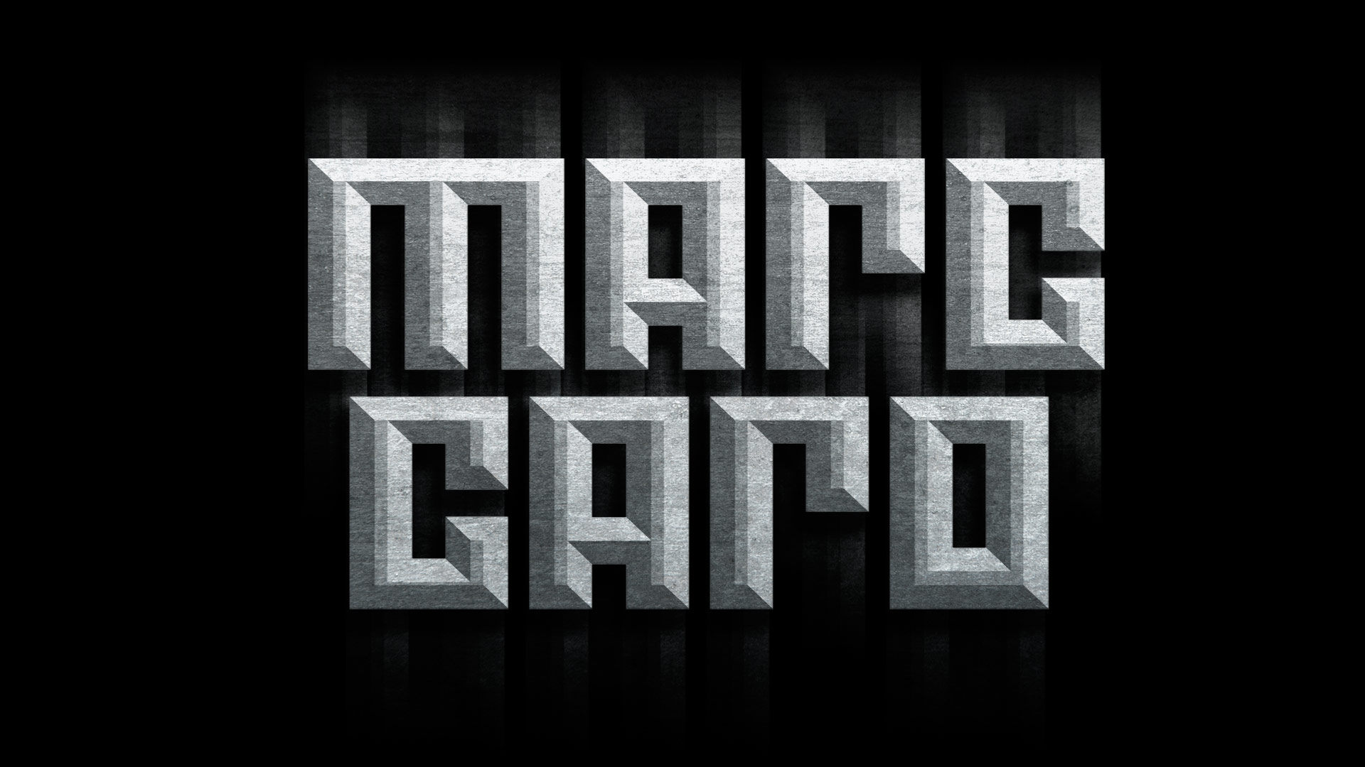 This Marc Caro would be a great title for a magazine but not on a digipack which is why i am so put off by it i feel that for it to be effective it would need to be quite big and consume most of the digipack.
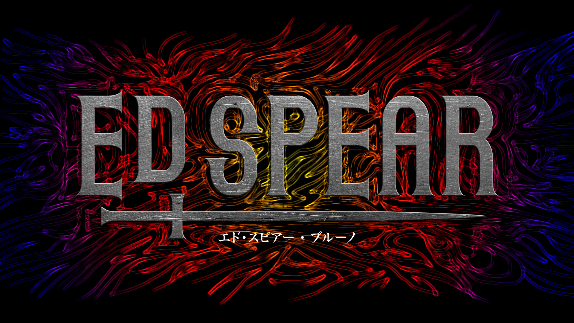 Same with the title above i feel that this one would require a lot of space on the image. However i like the font and the medieval feel it gives with the use of the sword below. Also that sword links with Treys album as it is called Trigga and the sword displayed seems like a T on a horizontal level.
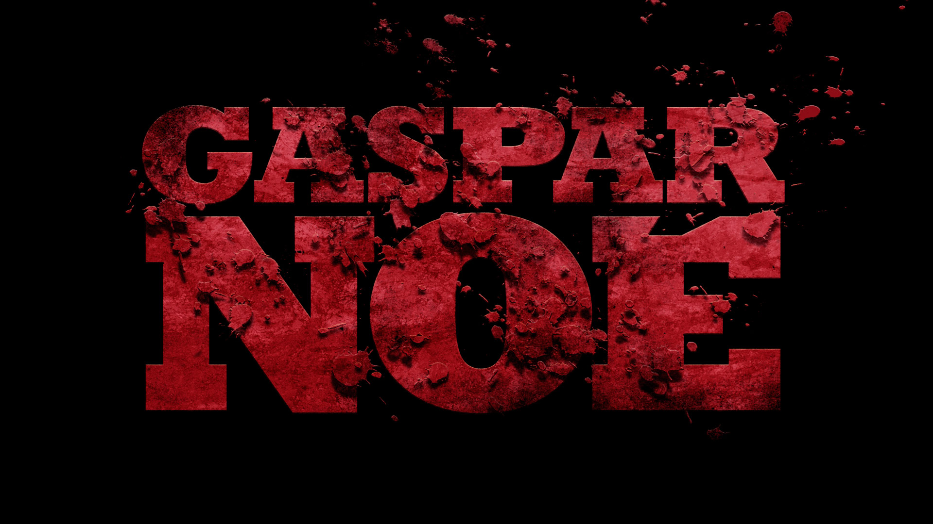 I really like this picture on the right and i think that if it was to be in black and white it would be very effective. However i think that it would consume a lot of the image as well
Out of the three i like the second one the most, whether it will be the one i pick I'm unsure. If i was to pick it i would have to make sure i removed the animal like pattern at the back. The third one is also one that i could possibly use due to the bloody effect it has on it.
Another website i looked at to try and discover more fonts was http://www.dafont.com/new.php?page=2&text=Trigga. What i liked with this website was that i can type in the name of my album title and it would give me a range of fonts with the given name. the picture on the right shows an example of this.

These are the titles i am going to experiment with and i am going to construct a questionnaire and ask


My personal favourites are
Now the next step os to work out which ones the public like and see whether they pick the ones that i like. If they don't pick the ons i like then i will have a hard decision on whether to go with the public or my own personal vote.
 My questionnaire was close to accurate with the majority of people i asked picking one of the three that i liked the most and at the end it was those three that were the final contenders. i think that the one that i am going to go for for the digipack is going to have to be the font i have put below. I like this one because of the expanding bottom half of some of the letters, it makes jot stand out a lot more. its also very simple and clear to read, the other two may cause problems to read which is something i don't want.
Final font type for the digipack.
Picking an ideal picture
Taking the correct picture is going to be the crucial part in my digipack and it will be the first thing that will draw people to my digipack.
These are the pictures that i took and one of them will be the on the front cover of my digipack.


Top 5 that i like the most and feel i could use are:
These are the five pictures that I like the most they all have unique posses that could possibly draw people to want to have a look at the digipack. I have also had an idea of instead of having one picture i can have 3 pictures. The pictures I am going to have as the three main pictures are.
What I like about these is that they all fit in together. As one picture this will be a test for one example of what I can used for my digipack. I will also grab a few of the pictures above and try to make them into potential digipack covers. I will again gather the publics view but constructing a questionnaire to workout which one they like the most.
Learning how to use Adobe Photoshop
This video talks about the basics of photoshop. I had never used photoshop before so this video helped me see an insight of the sort of things that i could do with photoshop, bearing in mind that these were the simple basics of photoshop. one of the examples in this video was something that i had in mind already which was putting two different images into one image. This video helped me see it was possible and very easy to do.
Looking into what i what for my Digipack
 I am looking into Digipacks from artists in the same genre as Trey Songz. By doing this it will enable me to spot the conventions of that genre and try and incorporate that into my Digipack as well.
The Digipack on the left belongs to Rihanna. With this digipack Rihanna has used a 6 panel digipack and it it full of colour and has a vibrant feel to it. I lie how the titles compliment the picture more being near enough invisible. As Rihanna's face is brightly lit same with the back ground, i feel if the titles were bright themselves that would hinder the picture and take away from Rihanna's beautiful face. So the contrast there was well thought out i think. If i decide to make my digipack colourful and vibrant then i have to make sure that the titles and picture compliment each other.
This picture on the left belongs to Keb Darge and Paul Weller. with this digipack they have down the opposite to what Rihanna has done with her digipack. This time round it is the titles that stand out the most as opposed to the picture of the artist. i have looked into who Keb Darge and Paul Weller are. It appears Keb is a Scottish Dj and Paul is a singer-song writer. The digipack purely includes R'n'B songs that they have created. Now having the titles brighter than the image makes more sense as they are more known that woman in the image. if the want to entice people to purchase their album it needs to be clear who the artists are. which is why i think they made the image black and white and the titles bright so that the names of the artists stand out more and will be easily recognised. Opposite to that is the Rihanna digipack. titles are not a big deal because her face is easily recognisable to people which will invite them to purchase the digipack.I think for me i have to try and see whether or not i should go for bright titles because Trey is not as known as artists such as Rihanna. However this is in England. He is more known in America than England. The other option is that i make his image more vibrant and the titles dim and hope that the public recognise his image when the digipack is out.
Practising with titles
http://www.creativebloq.com/design/top-movie-title-sequences-10121014
The above website i where i found out some information in titles and also it gave me a range of titles to look at that i can analyse and try gain inspiration from.
these are some of the titles that they had on that website. I am going to look anthem individually and see which ones i like the most and try and incorporate it into my digipack
This Marc Caro would be a great title for a magazine but not on a digipack which is why i am so put off by it i feel that for it to be effective it would need to be quite big and consume most of the digipack.Same with the title above i feel that this one would require a lot of space on the image. However i like the font and the medieval feel it gives with the use of the sword below. Also that sword links with Treys album as it is called Trigga and the sword displayed seems like a T on a horizontal level.I really like this picture on the right and i think that if it was to be in black and white it would be very effective. However i think that it would consume a lot of the image as wellAnother website i looked at to try and discover more fonts was http://www.dafont.com/new.php?page=2&text=Trigga. What i liked with this website was that i can type in the name of my album title and it would give me a range of fonts with the given name. the picture on the right shows an example of this.
These are the titles i am going to experiment with and i am going to construct a questionnaire and ask
My personal favourites are
Now the next step os to work out which ones the public like and see whether they pick the ones that i like. If they don't pick the ons i like then i will have a hard decision on whether to go with the public or my own personal vote.
My questionnaire was close to accurate with the majority of people i asked picking one of the three that i liked the most and at the end it was those three that were the final contenders. i think that the one that i am going to go for for the digipack is going to have to be the font i have put below. I like this one because of the expanding bottom half of some of the letters, it makes jot stand out a lot more. its also very simple and clear to read, the other two may cause problems to read which is something i don't want.Final font type for the digipack.Picking an ideal picture
Taking the correct picture is going to be the crucial part in my digipack and it will be the first thing that will draw people to my digipack.
These are the pictures that i took and one of them will be the on the front cover of my digipack.
Top 5 that i like the most and feel i could use are:
These are the five pictures that I like the most they all have unique posses that could possibly draw people to want to have a look at the digipack. I have also had an idea of instead of having one picture i can have 3 pictures. The pictures I am going to have as the three main pictures are.
What I like about these is that they all fit in together. As one picture this will be a test for one example of what I can used for my digipack. I will also grab a few of the pictures above and try to make them into potential digipack covers. I will again gather the publics view but constructing a questionnaire to workout which one they like the most.
Learning how to use Adobe Photoshop
This is another video that i looked at that helped me gain more knowledge on how to use photoshop.
Practising


to do the dripping effect i stubbled over it by mistake but i liked it a lot, to find it i had to go to the filter panel and look for liquify and then it took me to what you can see in the image on the right from there i was able to play around with the tools and drag parts of my artists body and make them drip.
 after deep consideration i changed the idea of making a T with images of my artist instead i took three images with one looking central and the other looking at the central image. I then added the album name under the images two letters for each picture which was a convenience

 The picture on the right was the above picture with the T which i downloaded from an online programme. I then moved it to photoshop and edited it used the fade tool to make look as the it does on the picture on the right. My aim for this is to have a T to like to Trey Songz and the name of the album which also starts with a T
This picture on the right was playing around with where i wanted the T sign to go. I thought that having it on the back cover would be a good place to place it. I also played around with making the T bold and darker in colour however i didn't like it as much as it looked faded and also it looked quite out of place on the back cover with the names of the track. I thought of removing it but i still liked the idea of having a T somewhere on the cover to link with Trey and the name of the album.
For my back cover i initially was going to have the big T as the image at the back However i felt that it was a bit miss placed so i looked at existing album covers and i seen Drakes Take care album which helped me come to a decision for my back cover.


Final picture

This is my final digipack image the front cover will be the three images of my artist. the back cover will be the image with the track lists on the bottom side, the inside cover will be where the name Trey Songz is written with the disk location where the T is.
My aim for this was to keep it simple and just have it black and white to link with the colour that mu music video is going to be in.